Monday, 9 December 2019

Sunset Overdrive Character - Weeks 9 and 10

Here is the final outcome I managed to achieve before the formative hand-in. The character is far from finished, and I was a bit disappointed I could not finalize it up until now. However, I felt like I needed to slow down a bit, since the stress and the long hours of work have caught up on me. I still need to create the hair cards for the eyelashes, eyebrows and the hairstyle itself.


I feel like I learnt a lot while working on this project, especially about skin and texturing in general. I spent the last two weeks working on the retopology, UVs, bake, textures and eyes, since I was sick with the flu and couldn't work much during week 8. The eyes proved to be quite a tricky part and I am still not completely satisfied with the result, but I will work more on them during the winter break.
The retopology is always a pretty straight-forward process. However, at some point I had to look up for some reference to see how other people retopologize big folds, that break the silhouette of the character. I observed the flow of polygons in several game character wireframe views I found on Pinterest, as well as this Polycount thread. ( link )
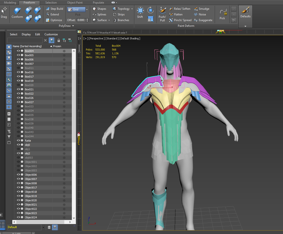
At first I tried using Zremesher. My idea was to use the retopology Zremesher created for the sleeve (where the folds are), and then edit the rest using Zspheres retopology. However, I couldn't get a decent result with the target polycount that I wanted to use. I wanted to have my polygons quite even across the entire model, and I feared that if I used this method I wouldn't fit in the tri-count later. Instead, I retopped the entire model in Zbrush. I feel like ever since I learnt how to do this, I gained a better understanding of controlling topology and edge flow, since I can always draw the topology on my character using polypaint before actually building it. I find it easier to do so, since I can always use isolate the lowpoly mesh I'm working on and its highpoly version and use Project. I found out this method helps me improve the bake considerably. Luckily enough, some of the work was already done for me, since the insert mesh brushes I created were quite low poly from the beginning and all I had to do was to duplicate the respective subtools and delete the higher subdivision for the low poly.


My UVs have always looked somehow messy and this time I really wanted to find a way to straighten them so as no space would remain unused. I had used peel mode before to fix the UVs, but I never realised I could use it to straighten the curved UVs. So, for the UV islands that were not cylindrical I used Pelt Map, then straightened them manually in Peel Mode and used align vertically/horizontally for the edges of the islands, while making sure there were no visible distorsions happening. For the somehow cylindrical shapes I used Unfold strip from loop, which creates nice and straight UVs.


I didn't have any major problems with the bake that I could not fix easily, by increasing or decreasing the cage size. The fishnet was a bit more complicated to solve, because when I created the NanoMesh I accidentally deleted some of the polygons on the side, but in the end I made it a little bit thicker and that solved everything.


Up until now I had followed the general look of the concept. However, I wanted my character to only be inspired by that concept.
At this point, I took some of the material references I used in the sculpting process and put them in one image :


 I tried out different colour palettes. I like the bold, vivid look of red/orange on the character's turtleneck and I like how it contrasts with the green tone of the skirt. I am fairly happy with the way it looks now, but I still consider changing them after I receive more feedback from our tutors.
Using the old logo of Tiamat for for T-shirt was just a personal preference. I had second thoughts about it, thinking I could either find a punk band, or write voodoo child (considering she has a rag-doll)

Went on to create colour and roughness variations:

Texturing the skin was quite challenging. I tried using actual pictures for the face and projecting them onto my model, for a more realistic result. However, I had to re paint most of it by hand, since the anatomy of the model didn't fit the pictures very well.


I also spent a lot of time trying to figure out how to do the eyes. At first, I tried following a tutorial where the eye was made up of 3 separate (not welded) meshes: the sclera, the cornea and the iris, which I sculpted in Zbrush. In Marmoset, I applied refraction on the cornea. However, I wasn't pleased with how it came out - the transition between the iris and sclera was very harsh and welding the edges of the two objects did not help. Also, this weird issue was happening:


Then, Lewis showed me another method to make eyes and that worked much better. After the formative hand-in, I looked up how other people set up their materials for eyes in Marmoset and tried to replicate that. I can now say I'm happy with how the eyes look.


Monday, 18 November 2019

Sunset Overdrive Character - Week 7

Last week I started looking for a good concept to model for the Sunset Overdrive brief. I gathered a bunch of random images and concepts I liked, but it was very hard for me to decide which one to choose. I managed to narrow my list down to four. My personal favourite was the maid and considering the wide variety of options this game offers in terms of character customization, I started modelling it right away. After finishing the base anatomy and the dress, I started having second thoughts whether i made the right choice or not - both the apron and the dress have ruffles on them and making them look good and deform well would take up a lot of polygons.


 The next day, I talked to my personal tutor, and he advised me to go for a concept that suits the style of the game better. One thing he pointed out was that the SO characters lack in small accessories, while the maid I had previously chosen has too much detail concentrated around the waist. Their clothes are usually simple and colorful. As a result, I am now working on the top left concept, the girl with the guitar.
I went on working with the same base mesh I created for my first attempt and created her clothes in Marvelous. Unexpectedly, there were many issues with the pleated skirt. I had may attempts where I started from a regular pleated skirt, and then sew the pleats pointing outwards to reduce the volume on the upper part of the skirt (and to accentuate her waist and hips, just like in the concept). the problem was that the pleats going inwards were protruding through the mesh, causing simulation issues. I was able to fix this by making another pattern, where the inward pleats were more narrow than the other ones. Additionally, I simulated all the sewing at once. This is how the pattern looks like:

Afterwards, I imported everything into Zbrush and proceeded to clean up the messy topology from MD. There were a lot of hidden triangles inside all the meshes, but I used ZModeler again to get rid of them and to weld the seams that were not welded. When everything was nice and subdivided, I added some extra wrinkles and folds, where necessary. This time, I will try not to rely so much on Substance Painter to create my surface details, but have them sculpted and baked onto the mesh.
This is how my model looked in an early stage:


At that point I wasn't very pleased with the anatomy of the face. I felt like it was too generic, with no personality and it didn't fit my character at all. I realised this after trying several haircuts on her.


It took me quite a bit of time until I reached a fairly good result with the face. I didn't have any specific feature in mind, other than big, almond-shaped eyes. I imagine her as a friendly and playful type. However, conveying her personality merely through her features is especially hard since the original concept does it through her face's expression. For now I'm alright with the result, but I might as well modify it again after deciding on a hairstyle. Even if I already added some of the tertiary details on the skin, it will be easy because I managed to keep all the subdivision levels.


While creating the skin pores and wrinkles I watched Realistic portraiture with Kris Costa, from the 2018 Zbrush Summit. He gave some amazingly useful insights on how he manages to create his hyper realistic portraits, on how he makes some of the alphas and other techniques. A funny tip that actually worked for me really well was to turn the character upside down from time to time, in order to trick your brain into thinking you're working on a different project. In my case, I was using a Lightcap, so when I turned the model upside down, the light affected it in a totally different manner and I could easily pinpoint some of the mistakes I made.
The brush I used for the small wrinkles on the palms and back of the hand were made with the standard brush and a default Zbrush alpha.


I wanted the stitches and all the other small parts to be separate pieces of geometry, so I would later be able to use polypaint and bake an ID map for everything, including the small details. So I created InsertMesh brushes and Curve IM brushes for the regular stitches, the "x"-shaped stitches, the eyes of the rag-doll and so on. For the skirt and the belt I used Zbrush Noise and then manually sculpted some additional details on top. I still haven't started detailing the blouse and the crop top, since I'm a bit worried about the current tri count. The file is already pretty heavy and I think I should start working on the remaining parts in a separate file.(including the shoes and the guitar)


Helmet Character - Weeks 4 to 6


Even though at first I wanted to update my blog every week, I now decided to do it each time I finish an important process, to share what I have learnt, what problems I encountered and how I solved them. I feel like this approach fits me better and I will find more things to mention here.


In the beginning I thought I wasn’t going to enjoy this project as much as I did. I’ve always had an irrational fear of modeling hard surface assets, since I am not a huge 3Ds Max fan and I used to rely solely on ZBrush when creating the high poly version of the character. For the entire summer I tried to dig deeper into ZBrush’s features, learn new “tricks”, work faster. The most useful tool for me that I started using only recently is be ZModeller. Before knowing anything about it, whenever I had topology issues, hidden polygons, holes or thin meshes I had to use a combination of ZRemesher, DynaMesh, colse holes, weld points, extract, inflate, or other ZBrush features to work my way around the problem.

However, all the new knowledge didn't help me much when it came to hard surface modelling. This time, I knew I had to raise my game at strict modelling if I wanted to finish this project on time. I started by organising my workspace and shortcuts so I wouldn't spend most of the time looking for menus, commands scrolling down, an so on. Despite trying my best to work as much (and efficient!) as I can, some personal issues made me take a couple of days off. 

Still, by the end of the third week I had started working on the high poly sculpt. Again, I went on to tidy up my workspace and edit the interface to fit the purpose of this project. A great advantage when using this workflow (3Ds Max -> Zbrush) was that I was able to keep subdivision levels until a late stage of the sculpture and I could easily make adjustments to the main shapes anytime. I think shape design is exactly what makes the concept look good and I wanted to make sure I capture everything as accurately as I could. However,  there were parts of the armour where I couldn't clearly distinguish the exact forms - the gauntlet and the chain mail. For the chain mail, I made a regular chain mail shirt using NanoMesh, with round chain links, but it looked very different to all the other pieces and it didn't fit in at all. So, I made my research on various types of chain mail and tried to come up with something that would feel natural and match the rest of the armour. I collected more reference pictures and made this second reference sheet:


Screenshots of the first chain mail and gauntlet versions:


 I also had to worry about mobility. The chain links, elongated as they are, wouldn't allow the knight to freely bend his arms. As a potential solving to this, I tried adding a velvet shirt underneath the chain mail. Here are sone renders of the final sculpture:


I quite liked the result, so I kept it like that, without worrying too much about how I was going to make a velvet material in Substance/Marmoset. Looking back, I think it wasn't a great idea. In order to convey the look of the material I had to actually set the cloth's metallic value to 1, so it could get dark reflections from the background. Additionally, I found out that if I change the Diffusion to Microfiber in Marmoset, I get a similar result to increasing the sheen value in Vray. The downside of this is that I could not add subsurface scattering, but I accepted the compromise just to make the velvet look a bit better.

Probably the most essential lesson this project has taught me is how important file backup is. After finishing the sculpt, I decimated it, but forgot to export the previous, non-decimated model. So, when I got to bake my mesh maps, most parts of the armour had serious baking issues on the edges. I had to log in on all the computers I used to see if I could get an autoback and luckily I did.

The most enjoyable part of the project was painting the textures. I got to explore a lot, compare the results and ask myself questions, such as "which parts of the armour are more exposed than the others?" or "Is the armour supposed to have any damage at all? what if it is new?"

 I started with a base metal on the armour, with the roughness value set to 0.5, then I added a bunch of layers with colour and Roughness variations. In the original concept the knight looks quite clean, with minimal surface damage to his armour. Still, I added some superficial scratches and small black spots, as in the third reference sheet. I liked the look, but I wanted to push it further. I feel like the extra damage adds a lot to the story behind a character. I gradually increased the colour variation, making the cavities a darker shade of gray/black and decreasing the metallic value. Then started to add more and more height variation as if corrosion started to affect the metal. However, if I were to start over, I would definitely create all these surface details in ZBrush from the beginning, since it's easier to control their shape and depth than in Substance.

The next step, rigging the character, might be my least favourite thing...ever. He looks a bit stiff right now, but I didn't worry too much about it. I can't imagine how much more comfortable one can stand while wearing an armour like this. If I have enough time in the winter break, i will address this issue, too.

These are my final shots. Overall, I am happy with the outcome. There were issues along the way, but i learnt a lot by trying to solve them. One thing that I will definitely change during the winter break is the length of the cape - I will make it  shorter, to ease the movement.


Monday, 21 October 2019

Helmet Character Brief - Week 3

For the second project I chose to model Joon Ahn's Demacian Knight concept. I messaged the artist and asked for permission to make sure there will be no problems when I post it.
 Then, I gathered some reference pictures to get a better idea of what each individual piece of armour might look like.

To start off, I sculpted a male figure using reference pictures. I tried to create the armour pieces in ZBrush, but gave up soon after I started. Instead, I modelled the armour in 3ds Max, making use of the freeform tools.


SoT Props - Week 2

I spent the second week baking and texturing the assets, making the plinth and lighting my Unreal scene. For the textures I tried to stay as much as possible within the diffuse and roughness values given in the Art Direction document.


  I tried different lighting scenarios in UE4 and this is the result-


SoT Props - Week 1

On this blog I will make a breakdown of all my university projects, trying to explain my thought process and workflow.

The first brief I chose to tackle is Rare's Sea of Thieves Props Brief, since I like stylised games and I never tried to model anything in this specific style.
During the first week I modelled all the assets in 3ds Max, using the orthographic views provided for an accurate result. Then I imported each one into ZBrush and started working on the high poly sculpt, using polygroups and ZModeler to crease the edges before applying subdivision levels.
After sculpting, I re-imported all the subtools, high and low poly geometry, into 3ds Max to separate them and prepare for baking.